The Science of Graphic Design
Design is all about making decisions. Every color, shape, line, piece of type, image and graphic will influence the message you are trying to convey.
There is no rulebook, no black and white guide to creating successful solutions. Furthermore, a successful decision for one piece won’t necessarily be the best answer to a similar situation in another.
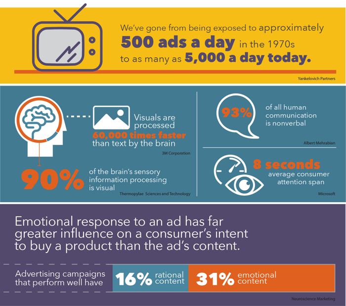
Emotional response to an ad has far greater influence on a consumer’s intent to buy a product than the ad’s content.
We know that we have a very short period of time to attract the attention of and engage our desired viewers. Thankfully, there are some principles that will assist in making design decisions.
Gestalt Principles
Gestalt is defined as “unified whole.” These principles reveal how elements are perceived in relation to one another visually. They also reveal how people tend to unify the visual elements into groups.
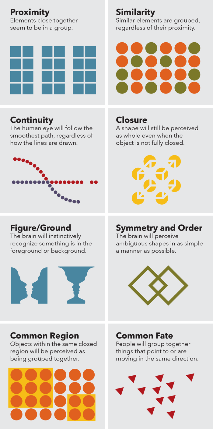
- Proximity
- Elements close together seem to be in a group.
- Similarity
- Similar elements are grouped, regardless of their proximity.
- Continuity
- The human eye will follow the smoothest path, regardless of how the lines are drawn.
- Closure
- A shape will still be perceived as whole even when the object is not fully closed.
- Figure/Ground
- The brain will instinctively recognize something is in the foreground or background.
- Symmetry and Order
- The brain will perceive ambiguous shapes in as simple a manner as possible.
- Common Region
- Objects within the same closed region will be perceived as being grouped together.
- Common Fate
- People will group together things that point to or are moving in the same direction.
The Gestalt principles can help visually organize and create interest, improving the user experience. Examples of these can easily be spotted in many logos, from the symmetry and order in the Olympic logo, closure in the World Wildlife Fund logo or figure and ground in the FedEx logo. These principles are relatively easy to incorporate and can elevate, leading to natural interactions that guide the user toward the action you want them to take.
The Von Restorff Effect

Also know as the “isolation effect,” predicts that when multiple similar objects are present, the one that differs from the rest is most likely to be remembered. Through color, typeface, size, etc., this effect can be used to grab attention and create contrast, which directs the user to a specific element on a page.
Color Theory
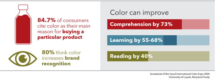 The study of how colors mix, match or contrast with one another and how humans perceive these interactions. In marketing, we focus on how these colors impact consumers' impressions with the intent of eliciting an action of feeling.
The following graphic is a broad generalization of the emotions certain colors provoke. Research has shown that personal preferences, experience, context and cultural differences muddy the effect that individual colors have.
More practical are the methods for combining colors into thoughtful, pleasing or unpleasant combinations. Each color relationship has a different impact on how the colors play off one another.
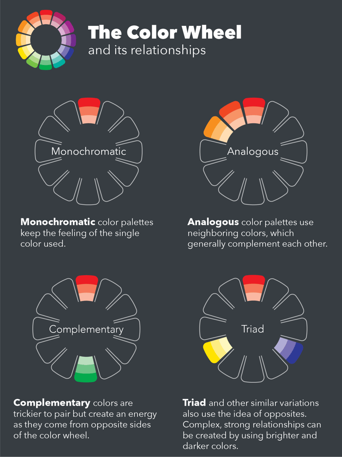
The Color Wheel and its relationships
Monochromatic color palettes keep the feeling of the single color used.
Analogous color palettes use neighboring colors, which generally complement each other.
Complementary colors are trickier to pair but create an energy as they come from opposite sides of the color wheel.
Triad and other similar variations also use the idea of opposites. Complex, strong relationships can be created by using brighter and darker colors.
Negative Space
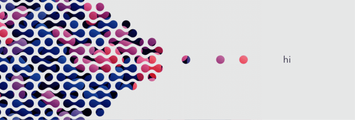
Also known as "white space," negative space is the area between and around objects—areas that we tend to. Even though we think of them as empty, these spaces hold a large amount of visual weight, and this space can work for or against you in a layout.
Careful organization of negative space gives feeling to a layout, creates motion and builds rhythm.
Visual Hierarchy
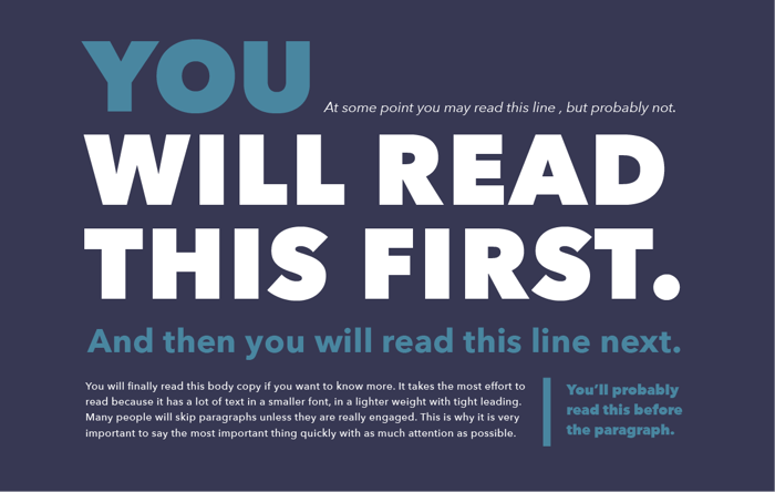
All of these principles, and others, are tools for creating good visual hierarchy. Meaning, the viewer knows where to start viewing a page and where to go next. Visual hierarchy controls the delivery of the experience.
Our cultural experiences are the starting point. Here in the West, we read left to right, top to bottom, large to small. But with size, color, shape, texture and contrast, we can alter that path, make it more obvious, create multiple paths or just create a confusing mess.
Delivering the message in a clear, concise manner is the first goal, but using these and other principles can help to make a design visually interesting and engaging to viewers.
Written By Jason Smith Associate Creative Director
